If you want to go fast, go by yourself. If you want to go far, go with others.
As solo developers, we all need to go fast at the beginning. We work on our projects in our spare time and most of the time we are the only developer on the project.
That means, as backend developers, we also have to build the design, the UI, the frontend.
Personally I’m not very good at design, in fact if I started building something completely from scratch, it would start looking like the default bootstrap templates, totally generic.
But after building a few side projects: LifeHQ and Focus Hub (that don’t look so bad) I have picked up a few tricks that helped me improve my designs, as a hopeless backend developer.
My top design tips for backend developers
Steal general concepts from similar apps
At the beginning, look for similar apps to your own. You can look at direct competitors or more broadly to apps in similar industries.
Basecamp and LifeHQ
For LifeHQ, I took inspiration from Basecamp.
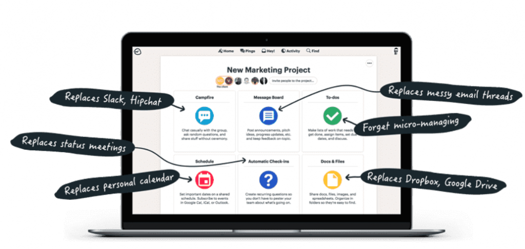
Basecamp is the all-in-one place for project management and team communication.
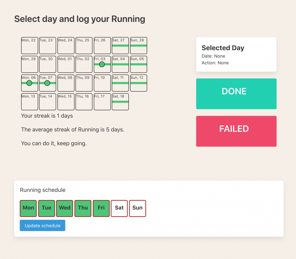
LifeHQ is the all-in-one place for personal productivity and achievement. So I took the concept of having a centralized design, with cards in the middle that represent all modules and give some insight from those modules. And it turned out quite nice. It is a good way to combine few different modules.
Basecamp’s project page.
LifeHQ’s personal productivity page.

Basecamp’s is more polished of course, but I added few more information related to personal productivity and my design has a flavor on it’s own. Even though I didn’t come up with the basic design structure on my own, I iterated and adjusted it to the needs of LifeHQ, making it unique.
Facebook, Twitter and FocusHub
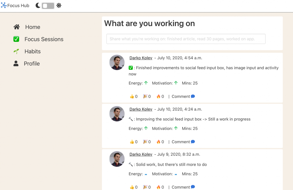
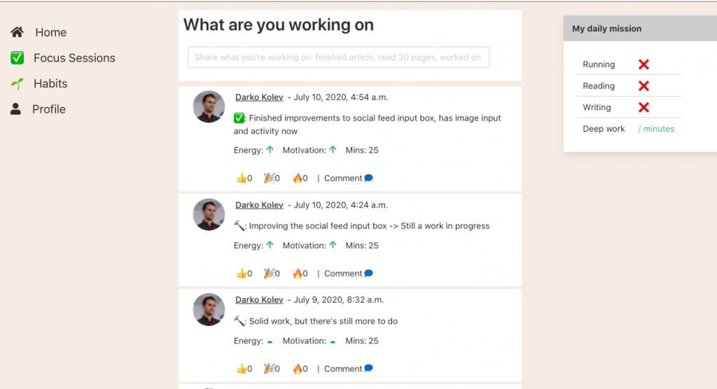
For Focus Hub I immediately started analyzing Facebook and Twitter. Direct competitors probably, but those are the gold standards for social networks. It is what people are used to see when they think of a social network.
The homepage at Focus Hub
Second Step: Iterate fast
Once you discover and borrow the general concept from another app, start to make it your own and iterate on it as quickly as possible.
To iterate means you publish a version that sucks, then work on it some more and publish a better version. Sometimes you get away from the design and work on backend, marketing or onboarding. Then come back with a fresh mind after a few weeks and iterate some more.
Use frontend themes
Frontend HTML and CSS themes are life savers for backend devs like myself. Of course they don’t have everything that you need, but they are great starting points.
For LifeHQ I bought one of the dashboard themes at Theme Forest. And for FocusHub I decided to go bare bones and start with Bulma.io, a css framework.
Use color palettes
There is a science behind choosing which colors to use on your website. Certain colors go together and others do not. Even when you’ve chosen good colors that go together, it is still important to use the right variations of those colors. So do yourself a favor and use some of the sites that provide professional color palettes like colorpalettes.net or coolors.co.
Also Canva has great blog post talking about color.
Dark themes are automatically cooler
As a developer I’m so glad this dark theme trend is happening. I’ve been using dark themes on my coding editors for as long as I can remember.
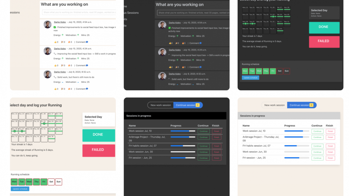
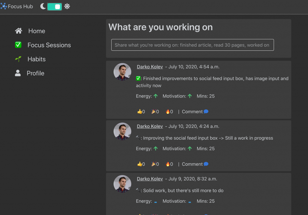
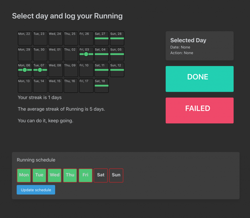
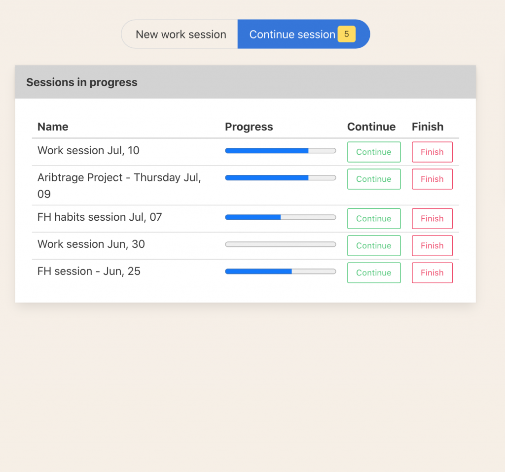
I’m not sure why, but to me, everything looks cooler in dark mode. So when you implement the same design in dark mode, everything looks better, here are screenshots of light and dark modes at Focus Hub.
The easiest way to make your design dark theme ready is to use css variables for defining your backgrounds and colors overall, explanation here, Then depending on the light or dark mode you just redefine those variables and everything changes.
Keep iterating
This is the most important rule so I’m mentioning it twice. If you’re like me, your design will suck at first but that’s ok, it’s normal. You have to keep iterating and keep making it better every day. That’s the same with any part of the software, or with anything in life. I you want something to look as good as it can, you must keep iterating.
Use your own app, personal experience is the best UX
Being the ideal user for your own app is one of the most important things when building side projects. If you are the target user, then you should be using your app daily and enjoying it and it should solve your problem.
And you are also biased, you probably think your app is much better than it really is :).
By simply being your app’s ideal user you get a sense of what the ideal user experience is like and how does the design feel when being used daily. Is it seamless and functional or is it boring and complicated.
However keep in mind that you know your app inside and out, while your users don’t. It is your job to make the design in such a way that your users naturally understand how to make the most out of it and enjoy the same benefits you are already experiencing, as the ideal user.
Those were my design tips for backend developers.
Until next time,
Stay productive and keep building.
Darko Kolev
Related posts
Categories
- About LifeHQ (2)
- Advice (4)
- Becoming better (7)
- Body & Mind (2)
- Case studies (2)
- Focus Hub (4)
- Guides (10)
- Journal (3)
- Lessons (5)
- Mindset (1)
- My Startup Journey (13)
- Personal Templates (1)
- product design (3)
- Productivity (10)
- Productivity Systems (2)
- Remote work (1)
- Roadmap (8)
- Routines (2)
- software (1)
- Success (1)
- Uncategorized (1)

